Color Changer Tools: Which Kind of Color Are You Changing
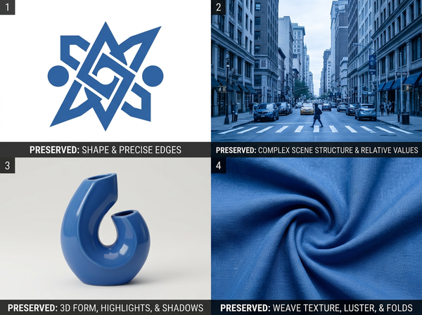
Four different operations share this name. They differ by what has to survive the change, not by what changes, and that is why one tool is poor at another’s job.
Four different operations share this name. They look similar described in a sentence and require different tools, and picking the wrong one produces a result that is technically correct and visibly wrong.
This article is about changing colors in images of products and materials. It does not cover changing anything about a person’s appearance, which is a different subject with different considerations.
One verb, four operations
Flat artwork. A logo, an icon, a piece of vector work. Regions of solid color, edges that are meant to be crisp, no texture.
A whole image. Shifting the color of an entire photograph — warming it, cooling it, pushing everything toward a cast.
One object in a photograph. A car, a chair, a bag. The object has form, so it has light and shade, and only that object should change.
A material. Fabric, leather, a knit. It has surface texture, it responds to light in a specific way, and its color is bound up with how it is woven or finished.
Most people arrive at this subject wanting the fourth and reach for a tool built for one of the first three. The result is usually usable enough that nobody investigates, and consistently short of what was wanted.
The difference is what must be preserved
Changing a color is the easy part in all four cases. What separates them is what has to survive the change.
Operation | What changes | What must be preserved |
Flat artwork | A value, exactly | Nothing — there is nothing else in the region |
Whole image | Every color, together | The relationships between colors |
One object | One region’s color | Shading, form, and a clean boundary |
Material | The color of a surface | Texture, weave, sheen, and how it takes light |
Read that right-hand column and the difficulty ordering becomes obvious. Flat artwork has nothing to protect. A material has four things to protect simultaneously, and they interact.
Flat artwork is the only exact case
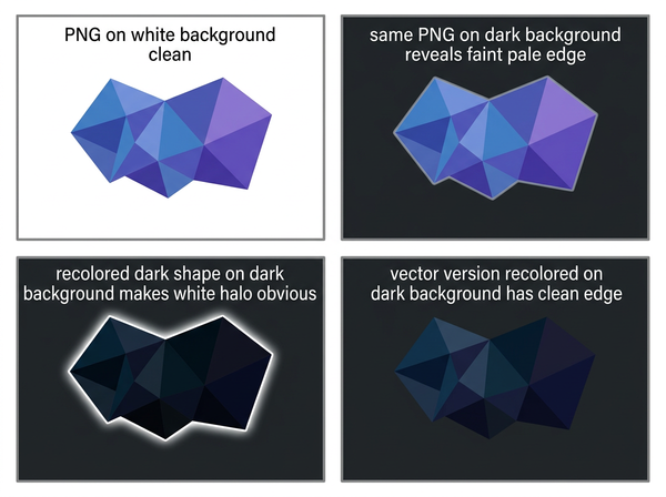
Recoloring a logo is a substitution. The region was one value, now it is another, and nothing else in it changes because nothing else was there.
That makes it exact and reversible, which no other case is. It is also the only case where the file format decides the outcome: vector artwork holds color as an attribute of a shape, so changing it is editing a property. A raster version of the same logo has color baked into pixels, including the antialiased pixels along every edge, which are blends of the color and whatever sits behind it.
Which is why recoloring a logo supplied as an image produces fringing at the edges, and recoloring the same logo supplied as vector does not. Same request, different outcome, decided by the file rather than by the tool.
That dependency is worth knowing before commissioning work rather than after, because it is not visible in a preview at normal size. Fringing appears at the edges, at magnification, on the version that goes to print — which is the point at which the only remaining fix is obtaining the original vector, if it still exists.
A whole-image shift is not a recolor
Pushing an entire photograph toward a color is a different intent that gets described with the same words. It preserves relationships — everything moves together, so relative differences survive — and destroys absolute values, which is exactly backwards from what a product image needs. A product photographed accurately and then warmed is now inaccurate about the product while looking pleasant.
This is the distinction between recoloring and color correction: one changes what something is, the other changes how the whole image was captured. Requests conflate them regularly, and the conflation is worth resolving before anyone opens a file.
Material is the hard case, and it is hard for a specific reason
A fabric’s color is not a layer sitting on top of a texture. It is the color of the fibers, seen through however the material is constructed.
A twill shows color differently along its diagonal than across it. A satin has directional sheen, so the same color reads light in one place and dark in another. A knit has depth, so shadow sits inside the structure rather than on it. Change the color naively and all of that flattens — the result is the right hue applied to a surface that has stopped behaving like cloth.
Preserving those properties while changing hue is the entire technical problem, and it is why garment recoloring is treated as its own operation rather than as a variation on object recoloring. What has to survive is not just shading but the material’s own way of taking light.
Why one tool is poor at another’s job
Tools optimize for what they preserve, which makes them bad at preserving something else.
A tool built for flat artwork replaces regions cleanly and has no concept of texture, so applied to fabric it produces a flat patch where cloth used to be. A tool built for materials preserves texture carefully, so applied to a logo it produces soft, slightly noisy edges where crisp ones were required. A whole-image tool moves everything, so applied to one object it moves the background too.
None of these are failures of the tool. Each is doing exactly what it protects, in a situation where something else needed protecting.
This also explains a pattern that looks like inconsistent quality. A team using one tool across a mixed catalog gets excellent results on some products and poor ones on others, and concludes the tool is unreliable. It is reliable — it is preserving the same thing every time, and that thing matters for some products and not for others.
Which is why the useful question when choosing is not how good a tool is. It is what it is built to preserve, and whether that matches what your image cannot afford to lose.
What the request should say
• What is changing — the region, object, or material, named specifically rather than as “the color.”
• What must survive — texture, edge sharpness, shading, or the relationship to other colors.
• Whether accuracy matters — a product color that customers will compare against a physical item has a different requirement from an image being made to look appealing.
• What the source file is — vector or raster, since for flat artwork that determines the outcome more than the tool does.
A request naming those four is unambiguous. A request saying “change it to blue” will be interpreted by whoever receives it, and their interpretation will be based on which of the four operations they usually perform.
What none of them can do
There is a limit shared by all four, and it is physical rather than technical.
A material can only be certain colors. Fiber content, dye chemistry, and finish constrain what a fabric can actually be, and a recolored image can display a color that no version of that material will ever hold. The image is not wrong as an image; it is wrong as a claim about a product.
The same applies to how a color reads across materials. Two fabrics given the same value in an image will not match in reality, because their surfaces treat light differently — which is a property of the materials rather than of the color specification. A recolored image showing a shell and a lining in the same shade is making a claim that two different materials will match, and that claim is decided at the dye house rather than in the file.
Recoloring answers what something would look like. Whether it can be made that color is a separate question, answered by whoever supplies the material.
FAQ
Which tool should I use for product photography?
Ask whether the product is a material or an object with a defined form. A bag with a smooth surface is an object recolor; a knitted garment is a material recolor, and the second requires preserving considerably more.
Can I recolor a photograph of a printed logo on a garment?
That case sits between two operations — flat artwork rendered onto a textured, folded surface. The logo needs crisp edges and the fabric beneath needs texture, which is why these are among the harder recolors.
Why does my recolored garment look like a flat sticker?
Almost always because the tool replaced the region without preserving the shading and texture that were carrying the material’s appearance. The color is correct and everything that made it look like cloth has gone.
Is it better to reshoot than to recolor?
For a single accurate product color, reshooting removes every question about accuracy. For a range of colorways from one sample, recoloring is the only practical route, which is why the accuracy question has to be managed rather than avoided.
Does file format matter?
Considerably for flat artwork and less for materials. Vector artwork recolors exactly; a raster image of the same artwork carries blended edge pixels that will fringe.
How do I know if a color is achievable?
That question belongs with whoever supplies the material rather than with the image. An image can display any color; a dye lot cannot.
Where this leaves you
Before choosing a tool, name what must not change.
That single sentence sorts the four operations, and it is the information that never appears in a request. Everyone specifies the new color, because that is the visible part of the intention. Nobody specifies the texture, the edge, or the shading — and those are what the wrong tool will quietly remove while delivering exactly the color that was asked for.
Name what must survive
Next time you brief a color change, write two lines instead of one: what is changing, and what must be preserved. Texture, edge sharpness, shading, relationship to neighboring colors — pick the ones this particular image cannot afford to lose. That second line decides which of the four operations is being requested, which decides which tool fits and which result you will accept. It is also the line nobody writes, which is why so many recolors come back with the right color and something else quietly missing. See how colorways are handled on garments.
→ https://www.style3d.ai/ai-fashion-design/clothing-colorways
Written by