
White Background Maker: Pure White vs. Almost White
Four different whites are in common use and they do different jobs. Most people asking how to make one want the strictest and need one of the other three.
“White background” names several different things. They look similar in a thumbnail, they do different jobs, and choosing between them is a decision most catalogs make by accident.
Four whites in common use
Pure white, meaning the specific value marketplaces require. It is a technical specification rather than an aesthetic choice, and it exists so that images from thousands of sellers sit uniformly in a search grid.
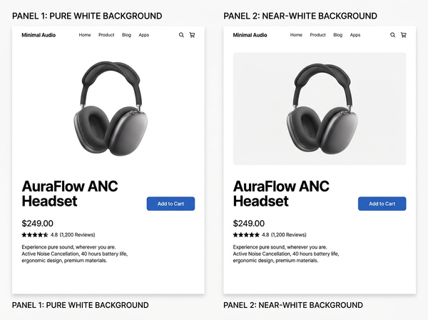
Near white, sometimes called paper white. Very slightly below pure, the way an unprinted sheet is. It looks white and it is not, and that small difference is doing work described further down.
Graduated white, where the background falls off toward the edges or corners. This is what a lit studio backdrop actually looks like, and it reads as a photographed space rather than a filled area.
White with a visible surface, where the product sits on something — a table edge, a subtle plane, a floor line. The product has somewhere to be rather than existing in a void.
Each is correct somewhere. The mistake is treating the first as the default because it sounds like the strictest option.
Part of why that happens is linguistic. A brief asking for a white background gets read as asking for the first one, because that is the literal reading, and nobody in the chain has a reason to ask which white was meant. The specification travels intact and the intent does not, which is a familiar failure whenever a common word turns out to name several things.
What each one is for
White | Primary use | What it gives up |
Pure | Marketplace listings, comparison grids | Shadow, edge definition, any sense of place |
Near | Own site, editorial, brand catalogs | Marketplace compliance |
Graduated | Studio-look product photography | Uniformity across a large range |
With surface | Furniture, footwear, anything needing scale | Cutout flexibility, background replacement |
The pattern in the right column is consistent: the stricter the white, the more is removed. That is the trade, and it is worth making deliberately rather than defaulting into.
Pure white removes the shadow, and the shadow was doing something
The contact shadow — the darkening exactly where a product meets the surface it rests on — is the only evidence in an image that the object is resting on anything at all.
Remove it and the product floats. Not dramatically; the image still looks fine, and most people cannot articulate what changed. What they experience is a slight loss of presence, a sense that they are looking at a picture of a thing rather than at a thing.
For marketplace listings this is unavoidable, since the requirement takes precedence and every competing listing has the same constraint. On your own site nothing requires it — and catalogs routinely apply the marketplace standard everywhere out of habit, paying a cost nobody asked them to pay.
This is the same trade that appears whenever a background gets replaced: whatever made the object look present was part of what got removed. On a marketplace it is the price of entry. Elsewhere it is a choice.
On a white page, a pure white image has no edge
This effect is invisible when looking at images and obvious when looking at pages.
Most product pages have white or near-white backgrounds. An image whose background is pure white placed on such a page merges with it — the boundary between image and page disappears, and the product appears to be sitting directly on the page among the text rather than inside a picture.
Near white keeps the image as an object. There is a faint rectangle, the eye registers it as a picture, and the product sits within a frame. That framing is doing layout work: it separates image from interface, groups the visual content, and gives the composition somewhere to end.
Editorial and brand photography uses near white for this reason rather than out of preference. It is the same consideration that governs how a page holds its elements apart, applied to the boundary between an image and everything around it.
Whether this matters depends on the page. Sites that place images in bordered containers or on tinted panels have solved the framing problem another way and can use pure white without losing anything.
It also depends on how much of the frame the product occupies. A product filling most of the image supplies its own edges, so the missing boundary is barely felt. A small product on a large white field is almost all background, and with a pure white background almost all of it disappears into the page — which is the case where the effect is strongest and where it most often goes unexamined, because a small product on white looks clean in isolation.
Mixing them is visible; choosing one is a brand decision
A grid containing both pure white and near white images reads as inconsistent. Nobody identifies which images differ or how, and the set looks unresolved.
So the choice is not per image. It is a standard applied to a whole catalog, and it belongs with whoever owns image standards rather than with whoever is processing a given batch.
The failure mode is gradual. A catalog starts on one standard, a batch gets produced by a different supplier or with a different preset, and the two coexist for a season before anyone notices — at which point half the catalog needs reprocessing to match the other half.
Detecting it early is easier than it sounds. Viewing the catalog as a grid, at thumbnail size, with the page background visible, makes a mixed standard obvious within seconds, because the inconsistency is between images rather than inside any of them. Nobody finds it by reviewing images one at a time, which is how images are usually reviewed.
When you need both, produce both from one master
Selling on a marketplace and on your own site means needing pure white in one place and having the option of near white in the other. That is two deliverables, and the wrong way to get them is to process the batch twice.
The workable arrangement is a cutout master with a transparent background, from which either version is produced by placing it on the appropriate fill. The cutout is the expensive step and it is done once; the backgrounds are cheap and can be regenerated whenever a standard changes.
That structure also makes a change of standard survivable. A catalog stored as flattened white-background images cannot be converted to anything else without redoing the cutouts. A catalog stored as cutouts can produce any background at any time, including ones that do not exist yet.
How to decide which white
• Where will this image be used? Marketplace listings settle the question; anything else leaves it open.
• What does the page it sits on look like? A white page argues for near white; a page with bordered or tinted image containers does not.
• Does the product need grounding? Footwear, furniture, and anything where scale or placement matters loses more from a floating presentation than a flat garment does.
• Will the standard need to change? If there is any chance of it, the answer is to store cutouts rather than backgrounds regardless of which white you pick today.
The first question resolves most cases. The remaining ones are where a decision is actually being made, and they are worth making once for the catalog rather than repeatedly by default — because a decision made repeatedly by default is a decision nobody remembers making and nobody can revisit.
FAQ
Is near white ever rejected by a marketplace?
Marketplace requirements are specific about the value, so anything short of it risks the listing. That is precisely why the two versions exist as separate deliverables rather than as one file used everywhere.
Does near white affect how customers perceive color?
It provides a reference point, which generally helps rather than hurts — a product against a very slightly off-white field is easier to judge than one against a field with no tone at all. The effect is small and consistent.
Should shadows be added if the background is pure white?
A shadow on the background is itself a departure from a pure white field, so on a marketplace listing it works against the requirement. On your own site it is available and is most of what near white is buying you.
What about transparent backgrounds?
A transparent file is the master rather than a finished presentation, since it renders against whatever is behind it. Storing transparency and generating backgrounds from it is the arrangement this article recommends.
How do I keep a catalog consistent across suppliers?
Specify the value rather than describing the look, since “white background” is interpreted differently by everyone. A specification that names the exact fill removes the ambiguity that produces mixed catalogs.
Can graduated white work for a large range?
It can, provided the gradient is applied identically every time, which usually means generating it rather than lighting it. Lit gradients vary between sessions, and that variation is visible across a grid.
Where this leaves you
Most catalogs use pure white everywhere because it is the strictest requirement anyone imposed on them, and applying the strictest rule everywhere feels safe.
It is not free. Pure white removes the shadow that told a customer the product was resting on something, and on a white page it removes the boundary that told them they were looking at a picture. Where a marketplace requires it, that is the cost of being listed. Everywhere else, it is a decision that was never actually made.
Look at your own page, not your own image
Open a product page on your site and look at where the image ends. If you cannot see a boundary between the photograph and the page, your images are pure white on a white page and the framing is doing nothing. Whether that matters is a judgment, and it is one you can only make by looking at the page rather than at the picture. Then check whether your catalog is stored as flattened backgrounds or as cutouts — the second can change its mind later. See how cutouts and background replacement work.
→ https://www.style3d.ai/image-editing-tools/background-remover
Written by