
Image Color Changer: Recoloring Without Artifacts
An image color changer moves a range of values, not one color. Why dark-to-light fails, how highlights betray you, and what to shoot first.
Changing a color in a photograph sounds like a lookup: find the pixels that are red, make them blue. That description is wrong in a way that explains almost every bad result. A garment is not one color. It is a range of values running from the brightest highlight to the deepest fold shadow, and the thing that makes it read as fabric rather than as a flat shape is the relationship between those values.
A color changer that respects the relationship produces a garment. One that does not produces a colored region where a garment used to be — the right hue, the wrong object. Most of the difficulty in apparel recoloring comes from the fact that the relationship is not the same in every direction, on every fabric, or under every light.
The direction of the change decides the difficulty
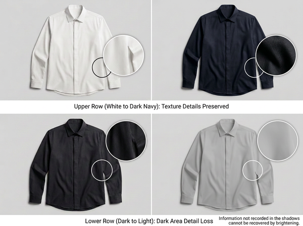
Dark to light is the hard direction, and it is hard for a reason no software can route around. When a dark garment is photographed, the shadow areas record almost no detail: the sensor captures a narrow range of very low values where the weave, the folds and the seam shadows all sit close together. Lighten that region and there is nothing to reveal, because nothing was recorded.
The visible result is a garment that looks smooth where it should look textured, especially inside folds. Reviewers often read this as a rendering problem and try to fix it with sharpening, which adds noise without adding structure.
Light to dark behaves better. Darkening compresses detail that already exists rather than inventing detail that does not, so a white shirt to navy usually survives, while the same shirt from navy to white usually does not. Planning a colorway shoot around this asymmetry — photographing the lightest version in the range — is one of the few decisions that improves every downstream recolor at once.
Highlights and shadows are not the garment’s color
The bright band on a satin sleeve is mostly the color of the light that produced it. On a matte cotton it is closer to a lighter version of the garment color, which is why the same recoloring approach gives good results on a tee and a plastic-looking result on a slip dress.
Materials sit on a spectrum here. Matte, opaque, diffusing surfaces — jersey, canvas, most wovens — reflect light in a way that carries the dye color throughout. Specular surfaces — satin, coated nylon, patent leather, sequins — produce highlights that stay close to the light source’s own color regardless of the dye beneath.
Recoloring a specular garment as if it were matte pushes those highlights toward the new hue, and the material immediately reads as synthetic. Recoloring it well means leaving the highlight band roughly where it was and moving only the values beneath, which is a judgment about the fabric rather than a setting.
A common assumption is that a shadow is the garment color, darker. In a real photograph it usually is not. Shadows pick up color from whatever is bouncing light into them: the floor, a reflector, the model’s skin, an adjacent garment.
That contamination is what gives an image depth. Strip it out by applying one hue uniformly across the whole garment and the piece flattens, losing the sense of a body underneath. This is the artifact people describe as looking “pasted on” without being able to point at a specific defect.
The practical consequence is that a good recolor has to be non-uniform. The hue shift in the deepest folds is not identical to the hue shift on the lit shoulder, and any process that treats the garment as one selection produces the flat version.
What actually breaks, and what it looks like
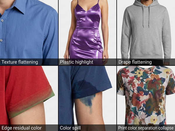
Failure | What you see | Where it comes from |
Texture flattening | Weave and fold detail disappears, most visibly in shadow | Lightening a region that recorded no detail |
Plastic highlights | Satin or leather reads as vinyl | Specular highlight shifted with the hue |
Flat drape | Garment looks pasted onto the body | One hue applied uniformly, shadow contamination removed |
Edge fringing | A halo of the old color at the garment outline | Selection boundary too hard, or hair and fuzz not accounted for |
Color bleed | New color appears on skin, background or an adjacent garment | Selection based on hue alone in an image with similar tones |
Print collapse | Multi-color print loses separation between its own colors | Recolor applied across the print rather than to a single element |
Prints deserve their own note. A two-color print on a colored ground is three separate recoloring problems, and treating it as one is how a logo ends up with its elements at the wrong relative values. When a print is involved, the ground and the print need separate treatment.
Where recoloring belongs in a colorway workflow
Recoloring is a production shortcut, not a design decision. The decision — which colors the range will run in — happens against physical references, and the image work comes after.
That ordering matters because a color that exists on screen may not exist in the fiber. Cotton, polyester and wool take dye differently, and a deep saturated shade achievable on one may be unreachable on another at an acceptable cost. A recolored image showing a color the mill cannot hit is a promise the product cannot keep.
Where the range is already approved and the physical samples exist, generating the variants from an approved base shot is straightforward, and building the colorways from one photographed style removes the repeat shoot without touching the color decision itself.
Getting the input right
• Photograph the lightest colorway in the range, since every other variant is then a darkening operation rather than a lightening one.
• Light for shadow detail rather than for contrast, because the recolor needs information in the folds and a punchy shot deliberately discards it.
• Keep the background tonally distant from the garment, as selection accuracy depends on separation and a gray shirt on a gray backdrop is a hard selection for any method.
• Include a color reference in a test frame so the base color can be verified before it becomes the parent of a dozen variants.
• Shoot the specular garments separately if the range mixes matte and shiny fabrics, since the two need different handling and a batch setting will suit one and ruin the other.
The first item on that list does most of the work. Teams that photograph the white or ecru version and generate downward have a fundamentally easier job than teams that shot the black one because it looked best in the studio.
Verifying the result
Screen comparison is not verification. Two monitors disagree, a phone disagrees with both, and none of them tell you what the dye does. The check that matters is against a physical sample under a single light source, which is the only reference that stays fixed.
Two habits make this practical. Verify the base image before generating variants, since an error in the parent propagates silently into everything derived from it. And check the variants against samples rather than against the parent, because a chain of comparisons drifts.
Where no physical sample exists — a color still in development — the honest position is that the image is an approximation, and it should not be published as if it were the product.
It is worth separating two jobs that get confused at this point. Changing a garment to a different colorway and correcting a photograph whose color is wrong are different tasks with different success criteria: the first invents a variant that has to match a sample, the second recovers a color that was already correct before the camera and the lighting interfered with it. Running a correction when you needed a colorway, or the reverse, produces work that cannot be checked against anything.
What a color changer cannot do
It cannot recover detail that was never captured. This is the hard limit behind the dark-to-light problem, and no amount of processing changes it. If the shadow region has no texture in the original file, the output has no texture.
It cannot tell you whether the color is achievable in production. Nothing in the pipeline knows about fiber, dye class or your mill’s capabilities, so an image can display a shade that no sample will ever match.
It cannot substitute for a physical color reference. Screen output is not a color specification, and a supplier matching to a screenshot is a dispute waiting to happen. Lab measurement or a physical standard remains the reference.
It cannot fix a bad base photograph. Uneven lighting, blown highlights and crushed shadows in the parent image are inherited by every variant, multiplied by the number of colorways generated from it.
Frequently Asked Questions
Why does my recolored garment look flat? Almost always because one hue was applied uniformly across the whole selection, removing the color variation that shadows naturally carry. A garment reads as three-dimensional partly because its shadows are contaminated by bounced light. Preserving that variation matters more than getting the target hue exactly right.
Can I recolor a black garment to white? Technically the operation runs, but the result is usually unusable for apparel because the shadow areas of a black garment contain almost no recorded detail. Expect flattened texture, especially in folds. Shooting the light version and darkening it is the reliable direction.
How do I stop the color spreading onto skin or the background? Separation in the original photograph does more than any selection technique. Where skin tone and garment color are close, or the backdrop sits near the garment value, the boundary is genuinely ambiguous and every method struggles. Reshooting with more tonal separation is often faster than fixing the selection.
Does it work on patterned fabric? It works on the individual elements of a pattern rather than on the pattern as a whole. A stripe changing from navy-on-white to green-on-white is one element changing; a plaid where three colors shift together is three problems. Treat each color in the print as its own job.
Will the output match my Pantone reference? Not reliably, and it should not be treated as if it does. Screen color and a physical standard are different systems, and the gap widens across devices. Use the image for presentation and the physical standard for anything a supplier or a buyer will act on.
Should I recolor the model shot or the flat-lay? Both, from the same verified base color, and check them against each other. Recoloring each independently is how a listing ends up with a flat-lay and an on-model image that are visibly different shades of the same colorway, which customers read as inconsistency in the product rather than in the photography.
The relationship, not the hue
The useful mental model is that you are not changing a color, you are moving a range of values while trying to preserve the relationships between them. Everything that goes wrong follows from that: flattening happens when the range collapses, plastic highlights happen when a specular band is moved with everything else, pasted-on drape happens when the shadow variation is normalized away. Judge a recolor by whether it still reads as fabric, and only then by whether the hue is right.
Shoot the lightest version first
Before generating a range, photograph the palest colorway you carry and light it for detail in the folds rather than for contrast. Verify that base image against the physical sample under one light source, then generate the darker variants from it and check each against its own sample rather than against the parent. Handle specular fabrics in a separate batch from matte ones.
→ Clothing Colorways — Style3D AI
Written by