
Image Recolor or Color Correction? They Are Not the Same Job
Confusing image recolor with color correction produces a variant of an error. How to tell them apart, and the order that keeps a set consistent.
Two requests arrive worded almost identically. One is “make this jacket green.” The other is “the green in this photo is wrong.” The pixels change in both cases, and everything else about the work is different — different reference, different success criteria, different person signing off.
Getting them confused is common and expensive. A team that runs a recolor when it needed a correction produces a variant of an error. A team that runs a correction when it needed a colorway spends a day chasing a target that was never in the file.
The difference is what you are matching against
A recolor invents something that does not exist in the photograph. The garment was photographed in navy; you need the same style in olive. Nothing in the file contains olive, so the output has to be judged against a physical sample of the olive version, or against the approved standard for that colorway.
A correction recovers something that did exist. The garment was olive when it went in front of the camera, and the file came back too warm, too flat or slightly yellow because of the light, the white balance or the sensor. The target is what the garment actually looked like, and the reference is the same physical sample the photographer had in the room.
That distinction sets the acceptance test. A recolor is right when it matches a sample of a different product. A correction is right when it matches a sample of the same product. If nobody can name which sample the output should be held against, the job has not been defined yet.
Symptom | Likely job | Reference to check against |
Every garment in the batch skews the same direction | Correction | Gray card or color reference from the shoot |
One garment needs to exist in a color you never shot | Recolor | Physical sample of the target colorway |
The flat-lay and the on-model shot disagree | Correction | The garment itself, under one light |
Two shots from different days disagree | Correction | The earlier approved image, plus the sample |
A print’s background must change but its logo must not | Recolor, element by element | Sample or approved artwork |
The color looks right in the studio and wrong on the listing | Neither yet — a display or profile issue | The physical sample, on a calibrated screen |
Where the color went wrong before you opened the file
Correction problems have causes, and knowing the cause is usually faster than adjusting until it looks acceptable.
White balance drift is the ordinary one. The camera made an assumption about the color of the light, and the assumption was slightly off, so the entire frame carries a cast. This affects everything in the shot equally, which is what makes it recognizable — the backdrop shifts along with the garment.
Mixed light sources are the harder version. A window on one side and a continuous lamp on the other means two different light colors falling on the same garment, and no single white balance setting is correct for both halves. The result is a garment whose left side and right side disagree, which no global adjustment fixes.
Bounce is the subtle one. A colored floor, a nearby wall or another garment on a rail throws its own color into the shadows. The garment is genuinely photographed accurately; a portion of the light reaching it simply was not neutral.
Exposure is the one people misfile as a color problem. A garment shot slightly bright reads as less saturated and slightly washed; the same garment shot slightly dark reads as deeper and richer than it is. Nothing about the color was recorded incorrectly, but the perceived shade changes, and correcting it as a hue problem moves the file further from the sample rather than closer.
Then there is metamerism, which catches people out because it is not a photography error at all. Two colors can match under one light source and visibly differ under another — a dye that matches the standard under daylight but shifts under store lighting. When a customer says the item does not match the photo, this is sometimes the real cause, and no correction to the file addresses it.
Correcting a set rather than an image
Single-image correction is the easy case, and it is not the one that costs teams time. The expensive case is a set: a flat-lay, an on-model shot, a detail crop and a lifestyle frame, taken with different lenses, possibly on different days, that must agree with each other on the listing page.
The failure here is not that any one image is wrong. It is that they are each slightly wrong in different directions, and a customer scrolling a product page sees a garment that changes color as they scroll. That reads as unreliable photography at best and as a different product at worst.
Two habits prevent most of it. Shoot a color reference in at least one frame per lighting setup, so there is a fixed point to correct against rather than a memory of what the garment looked like. And correct against that reference and the physical sample rather than against whichever image was processed first, since a chain of image-to-image comparisons drifts a little at every link.
Where a whole set needs bringing into agreement, correcting the color across the images as a group rather than one file at a time is the version of this work that actually holds up, because the target is consistency across the set and not the appearance of any single frame.
Order matters: correct first, then recolor
When both jobs are needed, the sequence is not optional.
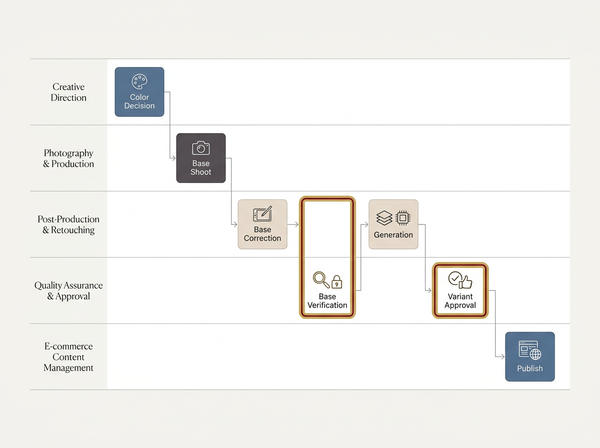
Correct the base image first, verify it against the physical sample, and only then generate colorway variants from it. Reversing the order means every variant inherits the original error, and the error is now distributed across a dozen files that all look internally consistent — which is the worst kind of mistake, because internal consistency is what reviewers use as a proxy for correctness.
This is also the point where the two jobs stop being interchangeable in practice. A verified base is a prerequisite for generating a range of colorways from one style, and skipping the verification to save an hour costs a day when the range comes back wrong.
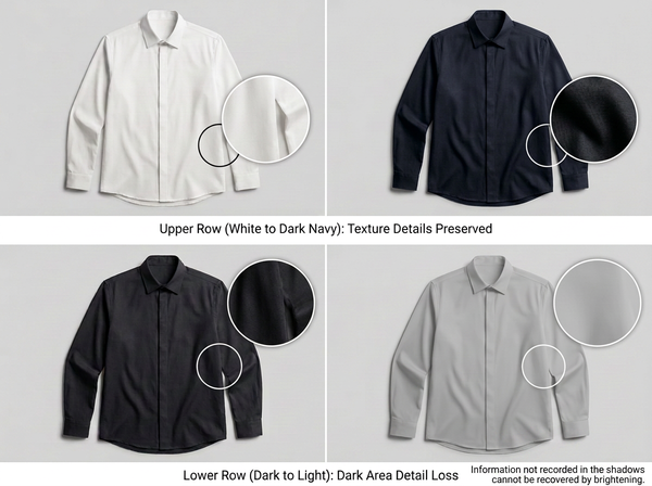
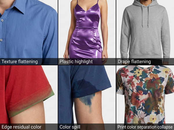
The physics of what happens during the recolor itself — why lightening flattens texture, why highlights on shiny fabrics have to be left alone — is a separate subject, covered in what a color changer is actually doing to a garment.
What a correct workflow needs in place
• A physical color reference in the frame for each lighting setup, since a memory of the color is not a reference and neither is an earlier image.
• A calibrated display for whoever signs off, because an uncalibrated screen means the reviewer and the retoucher are looking at different colors and neither knows it.
• A consistent color profile through the pipeline, so the file is interpreted the same way at every stage rather than shifting when it moves between applications.
• One viewing light for physical comparison, kept the same across sessions, because comparing under a window in the morning and under office lighting in the afternoon produces two different verdicts.
• A named person who owns the sign-off, holding the sample, not a group approving a screenshot.
None of these are expensive. They are the difference between color work that converges and color work that oscillates between people who each believe they are right.
What correction cannot do
It cannot recover a blown highlight. Where the sensor recorded nothing but maximum value, there is no color information to correct, and the area will stay blank whatever is applied to it. This is the same limit that makes overexposed white garments so difficult.
It cannot resolve a mixed-lighting shot with one adjustment. Two light colors on one garment need the regions treated separately or the shot needs redoing, and a global correction will simply move the error from one side of the garment to the other.
It cannot make a screen a color specification. A corrected file viewed on a calibrated display is a good representation; it is still not the reference a supplier should match to, and a dispute over a shade will always come back to physical standards and measurement.
It cannot fix metamerism. If a dye shifts under a different light source, the file is not the problem and no adjustment to it changes what the customer sees in a store.
Frequently Asked Questions
How do I know which job I have? Ask what the output should be held against. If the answer is a sample of a color you photographed, it is a correction; if it is a sample of a color you did not photograph, it is a recolor. When nobody can name a sample at all, the work is not ready to start.
Can I just recolor to the right shade instead of correcting? It appears to work and creates a problem later. Recoloring to compensate for a cast treats the garment region only, so the background, skin and any other item in the frame keep the original error, and the image becomes internally inconsistent in a way that is hard to trace afterwards.
Do I need a gray card if the camera has auto white balance? Yes, if the color has to be verifiable. Auto white balance makes a reasonable guess for a scene, not an accurate measurement for a garment, and it can change between frames as the composition shifts. A reference in the frame gives you something fixed to correct against.
Why do my flat-lay and model shots never match? Different lighting setups, usually, plus different distances and surfaces bouncing light back. This is a correction problem rather than a photography failure, and it is best handled by correcting both to the same physical sample rather than by adjusting one to match the other.
Is it worth correcting an old catalog retroactively? Only where the images sit next to newer ones. A product page mixing corrected and uncorrected images is worse than one that is consistently slightly off, since visible disagreement between images of the same item reads as a problem with the product.
Should the photographer or the retoucher own color? Whoever holds the physical sample at the point of decision, which in most operations is neither of them alone. The photographer controls what gets recorded, the retoucher controls what gets delivered, and the sign-off belongs to someone comparing the result to the garment. Splitting recording, processing and approval across three people works as long as the sample sits with the third.
What about color on mobile versus desktop? Expect variation and design around it rather than chasing it. Most customer devices are uncalibrated and many apply their own processing, so the goal is an image that stays acceptable across that range rather than one that is perfect on a reference display.
Name the sample before you start
The whole distinction reduces to one question asked before any file is opened: which physical thing is this output supposed to match? A sample of a different colorway means a recolor and a set of physics to respect. A sample of this colorway means a correction and a search for what the light did. No sample at all means the request is not finished, and the fastest thing anyone can do is send it back rather than start adjusting and hope somebody recognizes the result as right.
Decide the job, then set up for it
Before touching a file, name the physical sample the output has to match. If it is a colorway you did not photograph, treat it as a recolor and expect to respect the garment’s existing value range. If it is the garment in the shot, treat it as a correction: find a color reference from that lighting setup, put the sample under a single consistent light, and correct the whole set together rather than one image at a time.
→ AI Color Correction — Style3D AI
Written by