
Jewelry on Models: Scale Has No Reference Without Skin
A ring photographed alone could be any size. Jewelry is the category where an image is least able to answer the first question a customer asks about it.
Photograph a shirt and its size is embedded in its shape — sleeve length, shoulder line, the proportion of collar to body. Photograph a ring on white and it could be any size at all.
Jewelry is the category where an image is least able to answer the first question a customer has about the product.
Scale is the whole problem
Nothing in a jewelry photograph carries absolute size. A pendant fills the frame because the photographer moved closer, not because it is large. A pair of earrings can be shot to look substantial or delicate using the same pair and a different lens.
The only reliable references are body parts, which is why on-model imagery matters more here than in most categories. A necklace against a collarbone, a ring on a finger, earrings beside a jawline — those give a viewer something to measure against.
And even those references vary. Fingers differ, necks differ, and a piece that reads as delicate on one model reads as substantial on another. So the reference narrows the range rather than settling the number — which is still a considerable improvement over an image containing no reference at all, and it is the reason on-model imagery is not optional in this category the way it is in some others.
Generated jewelry runs large
There is a consistent direction to the error, which makes it predictable and therefore manageable.
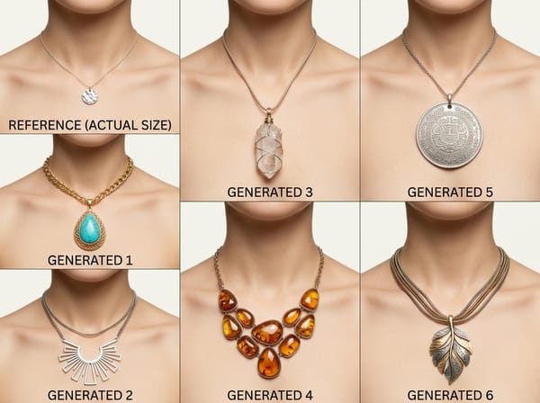
Generated pieces come out larger than the product they represent. Two causes appear to compound. Editorial and campaign photography is heavily represented in the imagery models learn from, and that genre deliberately oversizes pieces for impact — statement earrings, exaggerated chains, rings scaled for a magazine page rather than for a hand.
The second is more structural. A generator produces an image where the subject is legible, and a small piece occupying very few pixels reads as an error rather than as a product. Something in the process pushes toward visibility, and visibility here means size.
Both push the same way. This is the same pattern that runs through generated imagery generally — errors accumulate in the direction that looks better rather than distributing evenly — and in this category “better” means “more noticeable.”
The practical consequence is that a single generated image cannot be assessed for scale, because there is nothing to assess it against. The bias only becomes visible across several outputs compared with a known reference.
Which makes it a review process problem rather than a generation problem. Images are reviewed one at a time, by someone deciding whether this particular image is acceptable, and a systematically oversized piece passes that test every time — it looks like a good photograph of a piece of jewelry. Catching a direction requires looking at a set, and nothing in a normal approval workflow does that.
Metal has no color, only a reflection
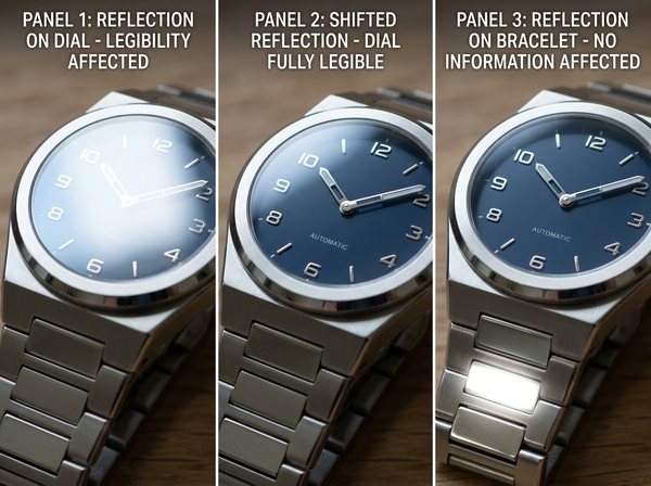
A polished metal surface is specular. It does not have a color that light falls onto; it shows an image of whatever is around it, compressed and distorted by its curvature.
Which means the appearance of a piece of jewelry is largely a property of the room it is in. Change the environment and the piece looks different — not slightly, but substantially, because what surrounds a subject determines what its surface shows.
This is why generated metal frequently looks wrong in a way that is hard to name. The highlights do not correspond to the lighting in the rest of the image, the reflections show a room that is not the one in the frame, and a curved surface reflects in ways that do not follow from its shape.
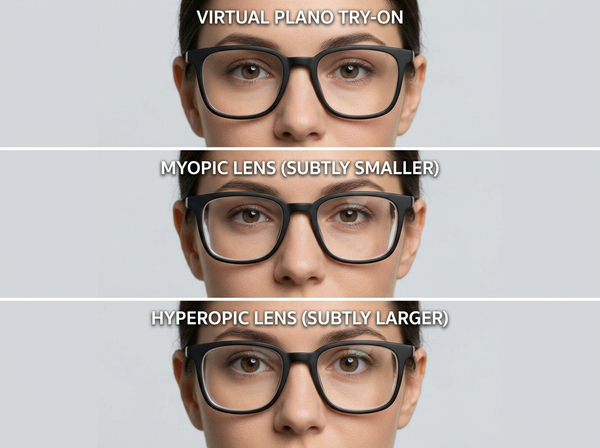
It also differs from a lens, which transmits and reflects at once and has a face behind it. Metal only reflects — and the reflection is the entire appearance, with no underlying color beneath it to fall back on.
Stones are a third behavior
Faceted stones do something neither fabric nor metal does. Light enters, bounces internally, and leaves in directions determined by the cut, which produces the flashes that make a stone look like a stone.
Generated stones typically miss this. They read as colored glass — the right hue, the right transparency, and none of the internal activity. The failure is recognizable to anyone who looks at stones and nearly invisible to anyone who does not, which describes most of a review process and a substantial share of customers.
Where it matters most is exactly where the purchase is most considered. A customer spending significantly on a stone is looking at the stone, and that is the region least likely to be right.
The same asymmetry appears with finishes. Brushed, hammered, and oxidized surfaces are more forgiving, because their appearance comes partly from texture rather than entirely from reflection. High-polish pieces — the ones photographed for the way they catch light — are where generated output diverges most, and again they are the pieces whose appeal depends on the property being rendered worst.
How a chain actually falls
A necklace does not sit where a designer places it in a drawing. It falls along the collarbone according to its own weight and the flexibility of its links, and different constructions fall differently at the same length.
A heavy chain drops and stays; a fine one follows the body’s surface more closely. A pendant pulls the chain into a V whose depth depends on the pendant’s weight rather than on the chain’s length. Earrings hang and, at the slightest movement, swing.
None of this is captured by placing an object in an image at a plausible position. It is the same problem as garment drape, at a smaller scale and with fewer forgiving factors, since a chain’s fall is governed by a small number of variables and viewers know what those look like.
What settles scale, and what does not
• A body reference in the frame narrows the range and does not fix a number, since bodies vary.
• A hand or a familiar object works for loose pieces and looks like a workaround rather than a product image.
• Dimensions in the copy are what actually settle it, and this is what most listings rely on whether they intend to or not.
• A detail shot at a stated magnification shows construction and says nothing about size unless the magnification is stated.
That third item is worth being deliberate about rather than treating as a fallback. If the copy is carrying the size information — and for jewelry it usually is — then it needs to be complete, prominent, and expressed in terms customers use rather than in terms a catalog system uses.
The images are then doing what they are good at, which is showing what the piece looks like, and detail imagery carries the construction evidence. The size question is answered in words because it cannot be answered in pictures.
What to capture
Shoot a body reference for every piece, at a consistent distance and framing across the range, so that pieces are comparable with each other even when absolute scale stays uncertain.
Shoot metal in an environment you control and keep it consistent, since the environment is most of what the metal shows. A range photographed in two different rooms will read as two different finishes.
Shoot stones with light that produces their internal behavior rather than light that produces a clean, even surface. Flat lighting makes metal easy and makes stones look like glass.
And photograph movement where it matters — a swinging earring, a chain settling — because still images of pieces that are defined by how they move are showing the least characteristic moment.
FAQ
Should jewelry always be shown on a model?
On-model imagery is the only thing in an image that supplies a scale reference, so it is doing work that no product shot can replace. Both are usually needed, since the product shot carries detail and the on-model shot carries scale.
Why does the same piece look different in two photographs?
Most often because the metal is reflecting two different environments. This affects polished pieces most and matte or textured finishes least.
Can generated imagery be used for jewelry at all?
For context, mood, and campaign work where the piece is not the subject of scrutiny, yes. For product imagery where a customer is assessing a stone or judging size, the two weakest areas of generated output are exactly the two things being assessed.
How prominent should dimensions be in the listing?
Prominent enough that a customer does not have to look for them, since for this category the copy is doing what images cannot. Burying measurements in a specification table treats them as secondary when they are primary.
Does a hand or coin reference look unprofessional?
It looks like a workaround, and it answers the question. Many customers prefer having the answer, and a scale reference in a secondary image rather than the hero resolves the tension.
What about rings specifically?
Rings have a size system, which does part of the work that images cannot, and the visual proportion of a band and setting still varies in ways the size number does not convey. Both pieces of information are needed.
Where this leaves you
Ask what in your images tells a customer how big the piece is.
If the answer is nothing, the copy is carrying the entire burden, which is fine as long as it is deliberate rather than accidental. If the answer is a generated image, be aware which direction the error runs — an on-model set with a consistent reference is the only visual mechanism available, and even that narrows the range rather than closing it.
Compare several outputs against one real piece
If you are generating jewelry imagery, produce several results for the same product and place them beside a photograph of the actual piece at the same body reference. One output tells you nothing, because there is nothing in it to measure against. Several will show you whether the error has a direction — and if it does, that direction is a correction you can apply to every future output rather than a mistake you catch one at a time. See how on-model image sets get built.
Written by