
Watch Photography on the Wrist: Dial Glare and Wrist Size
Two failure points that have nothing to do with each other. One sits on the glass, the other on the wrist, and neither is fixed by improving the other.
Two things go wrong with watch imagery, and they have nothing to do with each other. One happens on the glass. The other happens on the arm. Fixing either one does nothing for the other.
A flat crystal reflects a picture, not a smear
Curved metal surfaces distort what they reflect. A bracelet, a case side, a polished bezel — each compresses the room into streaks and highlights that read as shine rather than as anything identifiable.
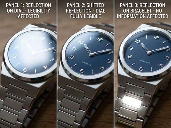
A watch crystal is flat, and flat mirrors do not distort. What appears on it is a recognizable image of whatever is in front of it: the window, the shape of the softbox, the camera, the photographer. Anyone looking closely can identify the studio.
That is a different problem from reflective metal generally, and it requires a different response. A curved reflection can be lit; a flat one has to be composed, because whatever is in front of the watch will appear on it in a legible form.
Domed crystals sit between the two, and anti-reflective coatings reduce intensity while shifting the color of what remains — neither removes the reflection, and both change what has to be planned for.
The reflection lands on the information
Here is why this matters more for watches than for other reflective products.
The dial is the product’s information surface. Hands, markers, a date window, the text — everything a customer reads about this watch is on that face. And the crystal sits directly over it, so any reflection appearing on the crystal covers exactly the region that has to be legible.
On a bracelet or a case, a reflection is a cosmetic issue: the surface looks bright rather than showing its finish. On a dial it is an information failure. A photograph where the reflection sits across the center is a photograph in which the customer cannot read the time, the markers, or the text — and those are the things that distinguish this watch from a similar one.
This is the same standard that governs detail imagery generally: an image exists to carry evidence, and evidence that has been covered is not evidence. Watches make it acute because the covered region is small, specific, and central.
Wrist size decides apparent size
The second failure point has no relationship to the first.
A watch has no apparent size of its own. It is large or small relative to the wrist it is on, and the same piece reads as a dress watch on a broad wrist and as oversized on a narrow one. Nothing in the photograph indicates which situation the viewer is looking at.
Wrist shots are the only imagery that speaks to this at all, which is why they are standard in the category — an on-body reference is the only mechanism available for conveying proportion. What the shot does not usually disclose is whose wrist it is, so the reference is present and uncalibrated.
The practical consequence is that two watches photographed on two different wrists cannot be compared, and customers do compare them, because comparing images is what a product page invites.
The comparison problem is worse across brands than within one. A brand shooting its whole range on one wrist at least gives its own pieces a consistent basis, whatever the absolute calibration. A customer weighing two brands is looking at two uncalibrated references and reading the difference between the wrists as a difference between the watches.
The dimension that decides fit is not the one that gets stated
Case diameter is the number in the listing. It is also not the dimension that determines whether a watch sits properly on a given wrist.
What determines that is the distance across the case from one lug tip to the other, since that span has to fit within the flat part of the wrist. A watch whose lugs extend past that flat area overhangs, and it will not sit level regardless of what its diameter says.
Two watches with the same diameter can have quite different lug spans depending on how the lugs are shaped and angled. So a customer comparing diameters is comparing a number that does not settle the question they are asking.
For imagery, this has a specific implication: a wrist shot showing the watch from directly above conceals the overhang, because overhang is visible from the side. The angle that flatters is the angle that hides the fit information.
Movement, strap, and what a still image omits
A watch is worn continuously and moves constantly, and two properties depend on that.
A bracelet or strap conforms to the wrist over the day, so a photograph taken at the moment of fastening shows a fit that will change. Metal bracelets in particular settle, and how they settle depends on sizing rather than on the watch.
Weight is absent entirely, as it is for every product in a photograph. For watches it matters more than for most accessories, since the piece is worn on a moving limb and its mass is felt continuously rather than noticed once.
Neither of these can be resolved with better photography. They are noted here because they are the questions customers ask in stores and cannot ask of an image.
What to shoot
• Angle the crystal so the reflection falls outside the readable area — usually a slight tilt is enough, and this decision is made at the camera rather than afterward.
• Control what is in front of the watch, since a flat crystal will show it. A large soft source directly ahead produces a clean, uniform reflection instead of a picture of the room.
• Include a side view, which is the only angle that shows lug overhang and case thickness. Both are invisible from directly above.
• State the wrist size in the copy for any wrist shot, since a reference without a scale is not a reference.
• Shoot the range on one wrist, so that pieces are comparable with each other even if absolute fit stays uncertain.
The angle choices are worth deciding once for the range rather than per product, since consistency in how each piece is framed is what makes a set comparable.
Where generated imagery struggles most
Both failure points get worse rather than better in generated output.
A generated crystal reflects something the model invented, so it will show a room that is not the studio in the rest of the image, and the reflection will frequently sit wherever it looks most attractive rather than where the optics would put it. Because the reflection carries information about the environment, an incoherent one is noticeable in a way that a wrong bracelet highlight is not.
Generated dials are the other difficulty. A dial is dense with small, precise elements — markers at exact intervals, hands of specific lengths, text at small sizes. It is exactly the kind of region generated output handles least reliably, and it is the region a customer inspects most closely.
Which produces the familiar pattern: the areas of a watch image that matter most are the areas generation is weakest on.
There is a workable division that follows from this. Generated imagery holds up for context and atmosphere — a watch in a scene, at a size where the dial is not being read. It does not hold up where the dial is the subject, which is every image a customer opens when deciding. Using it for the first and photographing the second is a reasonable arrangement, and it is more sustainable than trying to close the gap on dial rendering.
FAQ
Can polarizing filters remove dial reflections?
They reduce reflections at certain angles and do not eliminate them, since a flat crystal reflects strongly at the angles most useful for photographing a dial. Angle and what sits in front of the watch remain the primary controls.
Should the reflection be removed in post-production?
A crystal with no reflection at all reads as an open hole rather than as glass. Some reflection is what makes the surface legible as a surface, so the goal is placing it rather than deleting it.
Whose wrist should product images use?
One wrist for the whole range, stated in the copy. Which wrist matters less than that it is consistent and disclosed, since the value of the reference comes from being calibrated.
Does a side view really need to be included?
It is the only view that shows how far the case extends and how thick it is, and both determine whether a watch works on a given wrist. Omitting it removes the information a customer needs and keeps the information they already had.
How should a listing present sizing?
Give the span across the lugs alongside the diameter, since customers comparing diameters alone are comparing a number that does not settle fit. Adding the second figure costs a line and answers the actual question.
Is a video better than stills for watches?
It handles the reflection problem well, since a moving reflection reads as glass and the dial becomes legible as the angle changes. It handles the fit question no better than a still, because the wrist is still uncalibrated.
Where this leaves you
Look at your dial images and ask whether you can read them.
Not whether they look good — whether the markers, the hands, and the text are legible. If a reflection is sitting across the center, the image is showing an attractive object and withholding the information that distinguishes it from every similar object at a similar price. Then look for a side view, and if there is not one, the fit question has been left entirely to a number that does not answer it.
Tilt the crystal, then add the side view
Two changes, both made at the shoot. Angle each watch so the reflection falls outside the readable part of the dial rather than across the center — a small tilt usually does it, and it cannot be fixed convincingly afterward. Then add a side view to every product, because case thickness and how far the lugs extend are invisible from above and decide whether the watch sits properly. Neither costs a session; both answer questions your current images may be leaving open. See how a consistent image set gets built.
Written by