
Mixing Two Prints: Scale Conflicts Before Color Conflicts
Color clashes read as a decision. Scale clashes read as a mistake, because two motifs at competing sizes give the eye no way to decide what it is looking at.
Put two prints together and the first thing that decides whether it works is not the colors. It is how big the motifs are relative to each other.
Color clashes read as a decision. Scale clashes read as a mistake.
Three operations called mixing
The word covers three different things, and they have different constraints.
Layering places one print over another in the same area, which requires deciding what shows through and in what proportion. The output is a single new surface where both are present everywhere.
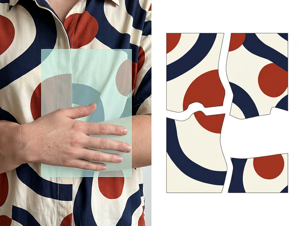
Zoning puts one print on some panels and the other on the rest. This is a garment decision rather than a print decision — nothing about either artwork changes, and the question is which pieces get which.
Merging takes elements from one and ground from the other, producing a design that is neither. This is original design work using two sources as material.
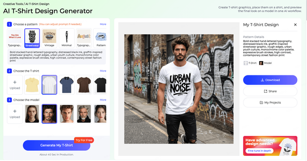
Tools that combine patterns generally offer all three under one label, and the judgment about whether a result is good differs for each. A layered result is assessed on whether both prints remain legible; a zoned one on whether the panels read as one garment; a merged one on whether the new design stands on its own.
Being clear about which one is intended before starting removes most of the disagreement that follows.
Scale decides before color does
The eye resolves size relationships before it resolves color relationships, and it is stricter about them.
Two prints in colors that fight each other still read as a composition. Contrast is a language — a viewer sees deliberate opposition, and whether they like it is a matter of taste rather than of legibility.
Two prints at similar scales do not read as a composition at all. They read as an image where something has gone wrong, and the viewer cannot say what because the failure is not in either print.
Which is why a combination that looks unpromising in a palette conversation can work immediately once one print is enlarged or reduced, and why a combination with a beautiful shared palette can remain unresolvable no matter how the colors are adjusted.
Field and figure
The underlying reason is that a viewer needs to organize what they are looking at into something in front and something behind.
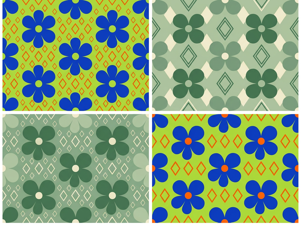
When one print has clearly larger motifs and the other clearly smaller, that organization happens automatically: the large one becomes the subject, the small one becomes the texture it sits on. The eye settles, and the combination reads as one designed surface.
When the motifs are at similar scales, neither can take the background role. Both compete for the same position, the eye keeps switching between them, and the result is experienced as visual noise. The viewer is not identifying a scale problem — they are reporting that it looks busy or confusing, which is what unresolved figure-and-ground feels like from the inside.
This is why the traditional guidance about combining prints is a rule about size rather than about style. It is not a taste convention. It is a statement about how the combination can be perceived at all.
It also explains why the problem resists discussion. Nobody in a review says the scales are competing; they say it feels chaotic, or too much, or that one of the prints should go. The vocabulary available to describe the experience does not point at the cause, so the conversation ends up being about which print to remove rather than about resizing one of them.
Two repeats do not share a repeat
Here is the constraint that decides feasibility before any of the above matters, and it is the one that gets discovered last.
Each print is built on a repeating unit, and that unit is a design decision with consequences downstream. Combining two prints into one printable surface means the combination has to repeat, and two units of different sizes only align again at a common multiple of both.
Where those sizes are simply related, the common multiple is manageable. Where they are not, it can be enormous — a combined unit many times the size of either original, which affects how the design is produced and can exceed what a given process handles.
The alternative is accepting that the combination does not tile, which is viable for a placed print on a single panel and not viable for yardage.
This is the check to run before any aesthetic conversation. A combination that cannot repeat at a workable size is not a design problem to solve; it is a pair of prints that will not go together in that form, whatever they look like on screen.
Color is the forgiving variable
Having established the order, it is worth being clear about what color does contribute.
Shared palette makes a combination easier to accept, and it is the usual route to making two unrelated prints feel intentional. Colorways are relationships rather than individual colors, so two prints sharing a relationship — the same contrast structure, the same distribution of light and dark — will sit together even when the hues differ.
Color is also the variable that can be adjusted after the fact. Recoloring one print to relate to another is a straightforward operation. Rescaling a print changes its relationship to the body and to the garment’s proportions, which is a design decision with wider consequences.
So the practical order is: check the repeat, settle the scale, then use color to tune. Reversing that means adjusting the variable that moves the outcome least, first.
What generated mixing produces
A generator combining two prints produces something plausible-looking, and the plausibility is concentrated in exactly the properties that are easiest to assess.
Colors will relate, because that is a surface property and models handle it well. The overall impression will read as a coherent design. What will frequently be absent is a repeat — the output is an image of a combined pattern rather than a tileable unit, and nothing about the image indicates which it is.
That distinction is invisible in a preview and decisive in production. An image that looks like fabric and does not tile is a mood reference, and treating it as artwork produces the failure at the point where a length is printed.
The other common absence is scale intent. A generated combination arrives at whatever relative sizes the model chose, which may not correspond to how the print will sit on a garment.
Both absences are correctable, and the correction is easier before anyone has approved a version. A generated combination is best treated as a proposal about direction — these two prints, roughly this relationship — with the repeat and the scale settled afterward by someone working to a garment rather than to a square preview.
How to evaluate a combination
• Establish which operation is intended — layering, zoning, or merging — since the criteria differ and arguments usually come from people applying different ones.
• Check that the combination repeats, at a unit size the production process can handle, before assessing anything visual.
• Look at it at garment scale, not at screen scale, since the figure-and-ground relationship depends on how large the motifs are on the body.
• Squint at it. Reducing detail leaves only the scale relationship, which is the property that decides whether it resolves.
• Adjust color last, since it is the variable with the most flexibility and the least structural consequence.
The squint test is the fastest of these and the most reliable. A combination that resolves into a clear foreground and background when blurred will work; one that stays ambiguous will not, and no amount of color adjustment changes that.
FAQ
Is there a rule for how different the scales should be?
Different enough that one clearly reads as ground, which depends on the motifs and on how far away the garment will be seen. The squint test answers it faster than any ratio would.
Can two prints of the same scale ever work together?
Zoning them onto separate panels avoids the problem entirely, since they are never competing in the same field of view. Layering or merging them at similar scales is where it fails.
What if the combination has to use two existing prints exactly?
Then scale is the only remaining variable, and rescaling one changes its relationship to the garment. That trade is usually the real decision, and it is better made explicitly than discovered.
Does this apply to placed prints as well as all-over ones?
The figure-and-ground reasoning applies to any two patterns sharing a field of view. The repeat constraint applies only where the result has to tile, so a placed print on a single panel escapes it.
How do I know if a generated combination tiles?
Tile it out to several times its own size and look at the joins. This takes a moment and is the only way to tell, since the preview will look the same either way.
Should the prints come from the same collection?
Prints designed together usually share a palette structure and often a scale strategy, which is why they combine easily. That is a shortcut rather than a requirement.
Where this leaves you
Check the repeat first, then squint at it.
Those two steps settle most combinations before anyone discusses whether the colors work — one for whether it can be made, the other for whether it can be seen. Color is the part everyone starts with because it is the part everyone has an opinion about, and it is the variable with the most room to move and the least bearing on whether the combination resolves at all.
Squint at it before you discuss it
Put the combination on screen, step back, and half close your eyes until the detail disappears. What should remain is one pattern reading as background and one reading as subject. If both are still competing at that level of blur, the scales are too close and adjusting the palette will not fix it — the eye has nowhere to settle. Do this before the color conversation, and before anyone becomes attached to a version. See how two patterns get combined.
Written by