
Print Placement: The Decision Nobody Writes Down
Print placement needs a reference point, a distance and a size. What changes across the range, and why collections drift out of line.
Every printed garment answers two questions: how big is the print, and where does it sit. On a single sample both get answered by eye, in about a second, by whoever is standing there. Across a size range they become decisions, and the decision usually never gets made explicitly — it gets inherited from whatever the sample happened to look like.
That is how a range ships with a chest print that looks deliberate on a medium, cramped on an extra small, and lost on an extra large. Nothing went wrong in production. The specification simply did not say what should happen between sizes.
Placement is a specification, not a preference
A usable placement instruction has three parts: a reference point on the garment, a measured distance from it, and a dimension for the artwork itself. Missing any one leaves the decision with whoever is setting up the press.
“Centered on the chest” specifies none of them. Centered horizontally on what — the panel, the body, the neckline, which may not coincide on an asymmetric style. Vertically positioned by what measurement, from where. And at what size, which is the question the next section is about.
The test is whether two different people, in two different factories, would place it identically from your instruction alone. If not, the instruction is a preference rather than a specification, and the two setups will differ visibly when the garments sit next to each other.
The reference point matters more than the number
Placement is usually measured from the high point shoulder — the highest point of the shoulder seam at the neck — or from the center back neck, or occasionally from the hem.
These are not interchangeable. Measuring down from the shoulder positions the print relative to the body’s upper anchor, which stays consistent as sizes change. Measuring up from the hem positions it relative to garment length, which changes with grading, so the print moves relative to the body across the range even though the number stays the same.
Neither is wrong; they answer different intentions. What causes problems is not stating which one you used, since a factory measuring from a different origin will produce a garment that satisfies the written number and misses your intent entirely.
Center front is the horizontal reference, and it is worth marking rather than assuming, particularly on styles with a placket, an off-center closure or an asymmetric hem where the visual center and the constructed center diverge.
Scaling across the size range: the decision to actually make
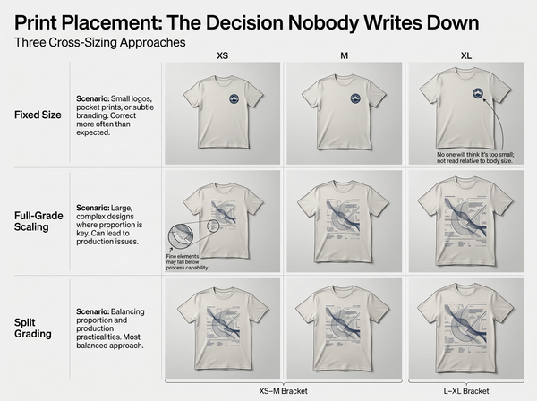
Approach | What happens | Suits |
Fixed size | Same artwork dimensions on every size | Small logos, chest marks, anything reading as an emblem |
Fully graded | Artwork scales proportionally with the garment | Large graphics where the print is the garment’s design |
Banded | Two or three artwork sizes across the range | Most cases, most of the time |
Fixed size is the default and is right more often than people expect. A small chest logo at identical dimensions across the range reads as consistent branding, and nobody perceives it as too small on a large garment because emblems are not read relative to body size.
Fully graded artwork gets used for large front graphics where a fixed size would look stranded on the biggest sizes and would not fit the smallest. Its cost is that the artwork’s own detail scales too, so fine elements can drop below what the process holds on the small end.
Banding is the compromise that survives contact with production: group the range into two or three bands and specify one artwork size per band. It avoids both failure modes and keeps the number of print files manageable.
The point is less which approach you choose than that somebody chooses. Where placing artwork on the garment shape is done visually before the range is specified, the comparison across sizes becomes something you can look at rather than something you discover on a sample.
Position also has to grade
Scaling gets discussed; vertical position often does not, and it moves too.
As a garment grades up, the body gets longer as well as wider. A print positioned at a fixed distance from the shoulder sits higher relative to the overall garment on larger sizes, and one positioned from the hem sits differently relative to the chest. Whether either matters depends on the design.
For chest prints, holding the distance from the shoulder usually keeps the print where the eye expects it, because it stays anchored to the body rather than to the garment’s length. For larger front graphics that read as a compositional element on the garment, the position may need to shift with the grading so the artwork stays balanced within the panel.
The safe habit is to specify position per band alongside size per band, since the two decisions interact and specifying one without the other produces a print that is the right size in the wrong place.
There is a related question that gets asked late and should be asked early: whether the print is applied before or after the garment is assembled. Printing on a cut panel before sewing allows artwork to run to the edge and across areas a finished garment cannot present flat. Printing on a finished garment is simpler and cheaper and constrains artwork to the area a platen can hold. The two produce different placement possibilities, and choosing after the artwork is finalized means the artwork usually has to change.
Where prints collide with construction
Artwork is designed on a flat rectangle; garments have seams, closures and hardware.
Side seams are the common collision on wide artwork. A print crossing a side seam has to match across it, which is a cutting and matching problem rather than a print problem, and it is often cheaper to reduce the artwork width than to solve it.
Plackets and zips interrupt any artwork crossing the center front. Where a design must span the opening, it needs to be designed to break there, with the interruption as part of the composition rather than an accident.
Pockets sit on top of prints and hide part of them. Patch pockets applied after printing can land anywhere within tolerance, so a design with detail in that area will be partially covered on some garments and not others.
Seams under a print create a surface that is not flat, and the print quality across a seam differs from the print quality on a flat panel. Keeping artwork clear of seams where possible avoids a category of quality complaint that has nothing to do with the artwork.
Consistency across a collection
A single garment’s placement is a decision. A collection’s placement is a system, and it is where the absence of a written standard becomes visible.
When several styles carry the same brand mark, customers see them together on a listing page and in a store. Marks at slightly different heights across styles read as carelessness, even to someone who could not say what is wrong.
The fix is a placement standard per garment type — one rule for tees, one for hoodies, one for outerwear — rather than per style. Garment types differ enough in neckline and construction that a single rule across all of them produces worse consistency than several rules applied faithfully.
Where a print is allover rather than positioned, the questions change entirely, and those belong to how a repeat behaves at garment scale rather than to placement.
What placement specification cannot do
It cannot make a print survive a process it is wrong for. A design with fine detail placed correctly is still a design with fine detail, and the process limits described in what a print file has to satisfy apply regardless of position.
It cannot guarantee the print lands identically on every unit. Every process has a placement tolerance, and garments are flexible objects loaded by hand. A specification defines the target; the tolerance conversation with your printer defines what arriving on target means.
It cannot resolve a design that fights the garment. Artwork sized to span a chest on a garment whose chest is interrupted by a closure will look compromised however precisely it is positioned, and the answer is a design change rather than a placement change.
It cannot make a print visible where the body will not present it. Artwork placed low on a front panel disappears under a fastened jacket, and artwork on an upper back sits under a bag strap for much of the time a garment is worn. These are not specification errors, and no measurement catches them — only thinking about how the garment is actually worn does.
It cannot substitute for looking at a physical sample on a form. Placement is judged by eye on a three-dimensional object, and a specification that looks correct as a measurement can look wrong on a body for reasons the numbers do not capture.
Frequently Asked Questions
Should the print scale with the garment size?
Usually not fully. Small logos and emblems work at a fixed size across the range, while large graphics need to change. Banding the range into two or three artwork sizes handles most cases and keeps the file count manageable.
Where should I measure the placement from?
The high point shoulder for most chest prints, since it stays anchored to the body as sizes change. Measuring from the hem ties the print to garment length, which grades, so the print shifts relative to the body across the range. State which you used.
How do I keep placement consistent across a collection?
Write a standard per garment type rather than per style, and apply it to every style of that type. Neckline and construction differences mean one rule for everything produces worse consistency than several type-specific rules.
What if the artwork crosses a seam?
Prefer redesigning to fit within a panel. Crossing a seam turns a print problem into a matching problem at cutting, with a cost in fabric and in rejects, and the visual result is rarely worth it unless the design specifically calls for it.
Can I use the same placement for men’s and women’s styles?
Rarely without adjustment. Necklines, body lengths and proportions differ enough that an identical measurement produces a visibly different result, and the print that sits well on one can sit high or low on the other.
How precise can placement actually be?
Less than a specification implies, since garments are soft and loaded by hand. Ask your printer what tolerance they hold, and design so that a print landing at either edge of that tolerance still looks intentional.
Do I need to approve placement on a physical sample?
Yes, on a form or a body rather than flat. A placement that measures correctly can read wrong in three dimensions, particularly on styles with volume or an unusual neckline, and flat approval misses exactly that.
Decide it once, write it down
The reason placement drifts across a range is almost never that somebody made a bad choice. It is that no choice was recorded, so each size and each style inherited a judgment made in a moment by a different person. Naming a reference point, a distance and an artwork size per band converts a series of small improvisations into one decision that can be reviewed, applied consistently and corrected when it turns out to be wrong. That is the entire difference between a collection that looks considered and one that looks approximate.
Write the three parts before the first sample
For each garment type, specify a reference point (usually the high point shoulder), a measured distance from it, and an artwork dimension — then decide whether that dimension is fixed across the range, graded, or banded into two or three sizes. Test the extremes: place the artwork on your smallest and largest sizes and look at both before approving the middle. Approve on a form rather than flat, since a placement that measures correctly can still read wrong in three dimensions.
→ Apply Print to Garment — Style3D AI
Written by