
Print Colorways: Why the Second Version Never Looks as Good
A print is relationships, not colors. Why derived colorways go muddy, the grayscale test, and which versions are harder to print.
The first colorway is designed. The rest are usually derived, and derived badly — someone swaps the hues, the file updates, and a pattern that read beautifully in the original comes back looking muddy, or flat, or like a different design entirely.
The cause is almost always the same. A print is not a set of colors. It is a set of relationships between colors, and swapping hues preserves the colors while destroying the relationships.
A colorway is a set of relationships
In a print with a ground and three motif colors, what a viewer perceives is not four colors. It is which elements come forward, which recede, which read as a group, and which the eye lands on first.
Those perceptions come from the differences between the colors — how far apart they sit in lightness, how much they differ in saturation, how the motif separates from the ground. Change all four hues while preserving those differences and the design survives. Change them independently and the design does not, even if every individual color is attractive.
This is why a colorway can fail while containing no bad colors. Each was chosen well; the set was not chosen at all.
Value, not hue, is what carries a print
The most reliable predictor of whether a colorway will work is the lightness relationship between elements, not their hues.
Two colors far apart in hue but close in lightness will merge at any distance. A mid-blue motif on a mid-green ground looks like two clear colors on screen at working distance and reads as a single textured surface across a room, which is the distance a garment is actually seen at.
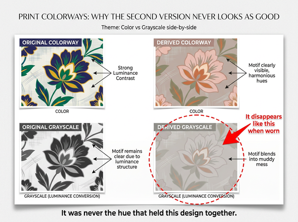
The test is to view the colorway in grayscale. If the motifs disappear, they will disappear in wear, and no amount of hue adjustment fixes it because hue was never what was holding the design together.
This is the most common failure in derived colorways, and it happens because the original was usually built with a strong lightness contrast that nobody consciously noticed. The derivation preserves the hue relationships, which are visible, and loses the lightness relationships, which are not.
Where a whole garment is being recolored rather than a print, the constraints are different and physical, and they are covered in what a color changer is actually doing to a garment.
The ground decides more than the motifs
Changing the ground changes every relationship at once, since every motif is read against it. Changing one motif color changes one relationship.
That asymmetry has a practical consequence: colorway families are easier to build by holding the motif relationships and moving the ground than by holding the ground and reworking the motifs. A pattern on white, on navy and on a mid-tone produces three genuinely different moods from largely the same artwork.
Dark grounds carry a specific trap. A design built on white and moved to a dark ground often needs its motif values inverted rather than merely re-hued — elements that were darker than the ground now need to be lighter than it, and simply changing their hue leaves them fighting the ground rather than sitting on it.
Ground also determines how much the print reads as a pattern rather than as a color. A busy print on a strong ground can read from a distance as a single mid-tone, which may be the intention or may be an expensive way to produce a plain garment.
Saturation does a job of its own that gets overlooked. Two colors at the same lightness and different saturation will separate slightly, but far less than lightness does, so saturation is useful for refining a relationship and unreliable for creating one. Designs that lean on saturation contrast alone tend to look striking on a calibrated screen and disappointing in fabric, where the ink cannot reach the saturation the file displayed.
Building a colorway system
A range of colorways is easier to keep coherent when it is built as a system rather than one at a time.
Start by identifying the lead element — the one the design is about — and decide what it does across the range. Usually it holds the strongest contrast against the ground in every colorway, which is what keeps the design recognizable as the same design.
Then decide how many colors the system has and hold that number constant. A colorway that quietly adds a fifth color because it looked better creates a production difference that surfaces later as a cost or a rejection.
Then build each colorway by assigning roles rather than colors: ground, lead, secondary, accent. Working in roles makes it obvious when a derived colorway has lost a role — the accent that became the same value as the secondary, so the design now has one less layer than it should.
Working in roles is also what makes a range of colorways buildable as a set rather than one at a time, and generating the colorways from one artwork is only as good as the role structure underneath it — a derived version inherits whatever hierarchy the original had, including a collapsed one.
Registration and trapping
Multi-color printing puts each color down separately, and they do not land perfectly on top of each other. Where two colors meet, small misalignment shows as a sliver of the ground or an overlap of the two.
Designs with many adjacent color boundaries are more exposed to this than designs where motifs sit isolated on a ground. A colorway that increases the number of adjacent color pairs — by making a background element the same family as a foreground one, for instance — can be harder to print well than the original even though nothing about the artwork changed.
Trapping is the standard remedy: deliberately overlapping adjacent colors slightly so that small misregistration does not open a gap. It is a production adjustment rather than a design one, and it works better when the design leaves room for it, which means avoiding fine light elements sitting directly against dark ones where a trap would be visible.
This is worth knowing at colorway stage because it means colorways are not equally printable. Two versions of the same pattern can have different production risk, and the one with more adjacent contrasting boundaries is the one to sample first.
Testing colorways as a set
Individual approval is how colorway ranges drift. Each version gets looked at alone, each looks acceptable, and the set turns out to be uneven — one version much stronger than the others, or two that are nearly indistinguishable on a rail.
Review them together, at the size they will be seen, and in grayscale as well as in color. The grayscale pass catches merging; the together pass catches unevenness; the scale pass catches everything the swatch hid, and the reasons scale matters so much for patterns are covered in how a repeat behaves at garment scale.
The order of approval matters as well. Approving the strongest colorway first sets an expectation the rest cannot meet, and each subsequent version gets judged against it rather than against the range’s purpose. Reviewing the weakest one first, or reviewing all of them before approving any, produces a more even set — and evenness is what a customer scrolling a product page actually perceives.
Where physical strike-offs are being produced, print the same portion of the pattern for every colorway. Comparing a strike-off showing one part of the design against another showing a different part compares two things that were never the same to begin with.
What a colorway change cannot fix
It cannot rescue a pattern with a weak structure. If the original design only worked because of one strong color relationship, the range will have one good colorway and several apologies for it.
It cannot make an unprintable design printable. Color count, adjacent boundaries and fine detail are properties of the artwork that persist through every colorway, and every file requirement the process imposes applies to all versions equally.
It cannot compensate for a ground the garment will not provide. A colorway designed against a paper white will look different on an off-white fabric, and on a fabric that yellows or grays with washing, which is a materials question rather than a color one.
It cannot guarantee dye and ink match across substrates. The same colorway printed on a woven and a knit, or on cotton and polyester, will not read identically, and expecting a single approved colorway to hold across a range of fabrics produces disputes that no file adjustment resolves.
Frequently Asked Questions
Why does my second colorway look muddy?
Almost always because the lightness contrast that carried the original was lost while the hues were being changed. Convert both versions to grayscale and compare — if the motifs are harder to distinguish in the new one, that is the whole answer.
How many colorways should a print have?
As many as the range needs, built as a system rather than derived one at a time. What matters more than the count is that each has the same number of colors and the same role structure, since a colorway that quietly differs in either creates a production difference.
Should I change the ground or the motifs?
Changing the ground is usually more efficient, since every motif is read against it and one change alters every relationship at once. Reworking motifs against a fixed ground gives finer control and takes considerably longer.
Can I use the same colorway across different fabrics? Expect variation. Ink and dye behave differently on woven and knit, and on natural and synthetic fibers, so a colorway approved on one substrate is a reference rather than a guarantee on another. Sample on each fabric you will actually produce.
Are some colorways harder to print than others?
Yes, and it is worth checking rather than assuming. A colorway with more adjacent contrasting boundaries is more exposed to misregistration than one with isolated motifs on a ground, even when the artwork is identical.
What is the fastest way to check a colorway range?
Look at all of them together, at garment scale, in grayscale. Three passes, a few minutes, and it catches merging, unevenness and scale problems that individual approval at working distance will miss entirely.
Do I need a physical strike-off for every colorway?
Where the print goes on a main product, yes, and print the same section of the pattern for each so the comparison is meaningful. Where colorways are minor variations on a secondary style, a subset may be enough — the decision should be about consequence rather than about count.
Design the relationships, then assign the colors
The reason derived colorways disappoint is that they are usually built as a color-picking exercise when the original was built as a composition. Roles, contrast and lightness relationships are what a viewer actually perceives; hues are what gets swapped. A range built by assigning roles first and colors second holds together, prints more predictably, and looks like one design in several moods rather than one good version and several weaker relatives.
Check every colorway in grayscale first
Before approving a colorway range, convert each version to grayscale and look at them side by side. Motifs that merge into the ground in grayscale will merge in wear, and no hue adjustment fixes it. Then view the set together at garment scale rather than as swatches, and confirm every version has the same number of colors and the same role structure — ground, lead, secondary, accent — since a colorway that quietly gained or lost a role has become a different design.
→ Graphic Colorways — Style3D AI
Written by